Nothing Technology: Concept Brand Redesign
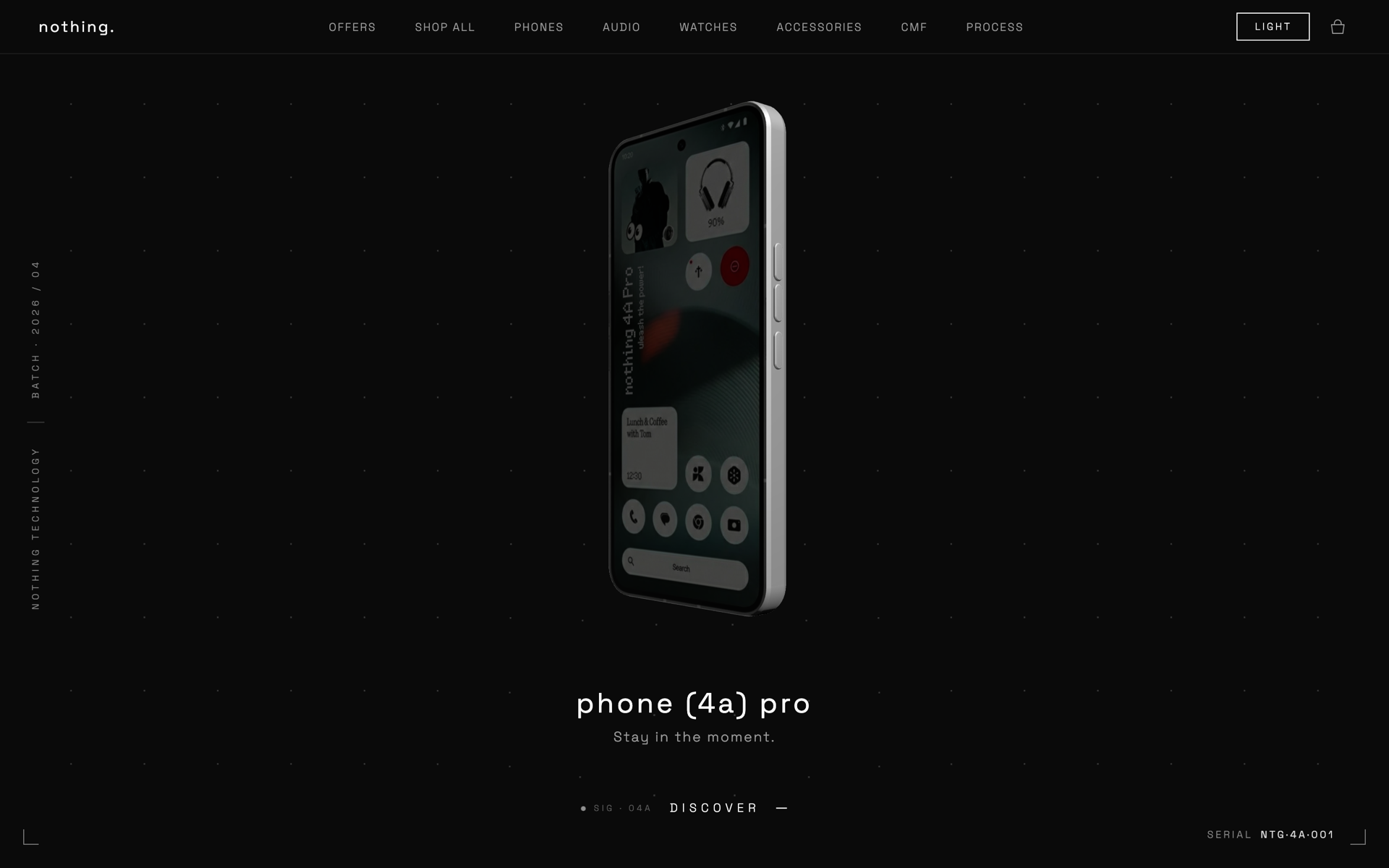
A scroll-driven, motion-first concept site for Nothing Technology, exploring how anti-design industrial language can translate into a kinetic web experience built around 3D product moments.
The Gap
Business gap
Brand sites for hardware companies often default to static product galleries and marketing copy. Nothing's identity: raw, industrial, dot-matrix, transparent, demands an interactive language that most templated brand sites can't carry. The gap was treating the website as packaging rather than as a continuation of the product's design philosophy.
User gap
Visitors landing on a hardware brand site want to feel the product before they read about it. A flat hero image and a spec sheet does not convey weight, materiality, or intent. The user gap was the absence of motion, depth, and considered interaction that the physical product communicates by default.
How I worked
Research
Studied Nothing's visual system: dot matrix, glyph patterns, monochrome palette, Space Grotesk-adjacent type voice. Looked at award-winning brand sites (Apple product pages, Bruno Simon, Active Theory) to map how scroll, 3D, and kinetic type are used to create presence without decoration.
Strategy
Treat scroll as the primary interaction surface. Anchor each section around a single 3D moment rather than a parallax gimmick. Commit to a monochrome palette, generous letter-spacing, and physics-informed motion that gives elements implied weight. Keep DOM and 3D strictly separated: React owns layout, Three.js owns the scene.
Wireframes
Sketched the page as a sequence of beats using Procreate: video intro → hero scene with floating product → navigation reveal → section transitions tied to scroll progress. Prototyped the hero scene with a single GLB model before layering in cursor influence and scroll-driven camera moves.
Iterations
Iterated on the hero camera path several times to balance product visibility against motion drama. Tuned GSAP easings toward elastic and back curves so transitions feel like objects settling rather than snapping. Rebuilt the navbar fade-in twice to avoid stealing focus from the hero moment.
What we built
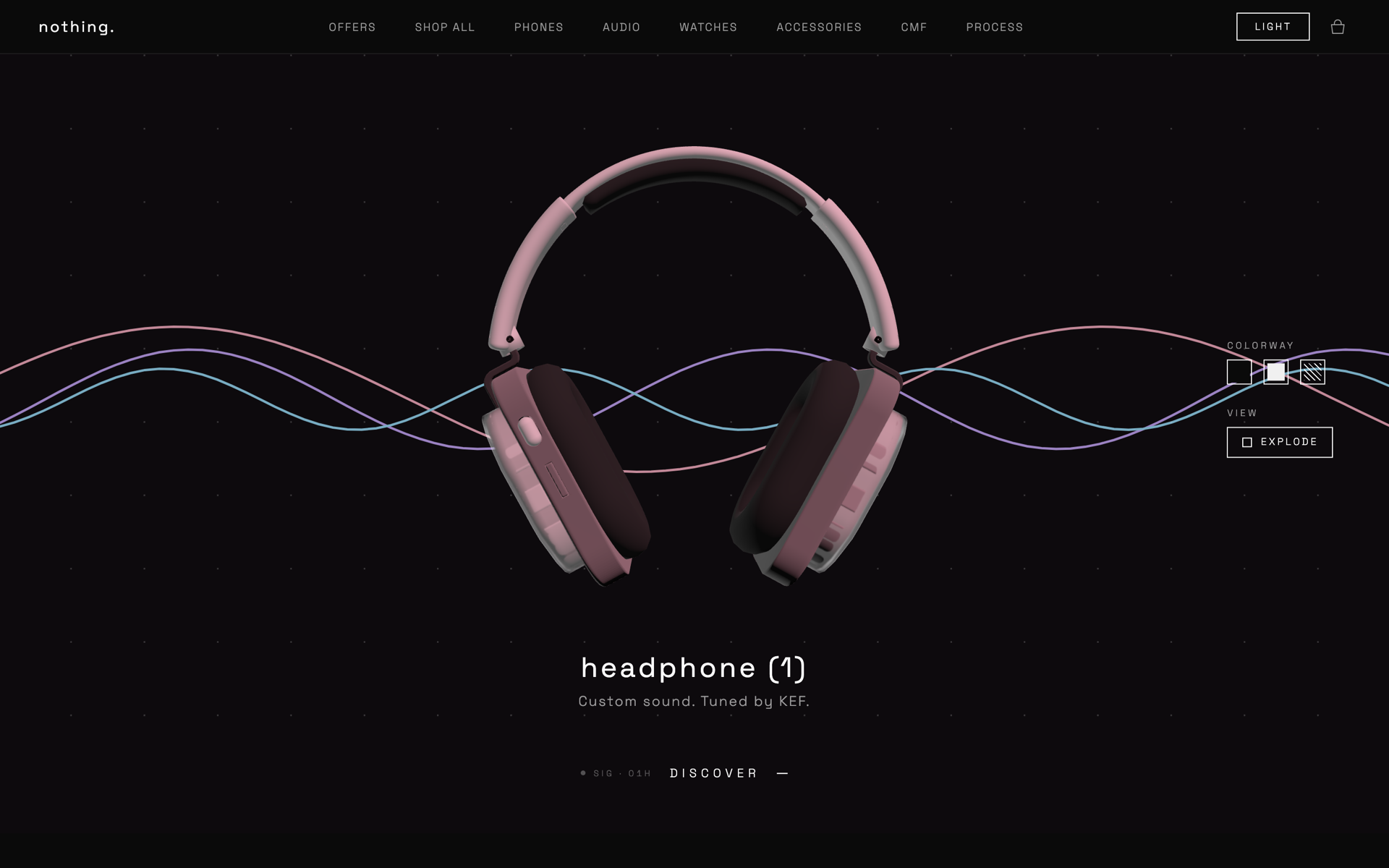
A single-page concept site built on Next.js 16 with a Three.js hero scene, GSAP scroll-driven animations, Lenis smooth scroll, and a video intro that hands off into the 3D moment. The architecture isolates scene logic in /src/scene and treats React components as DOM-only layout, keeping the renderer disposable and the layer boundary clean.
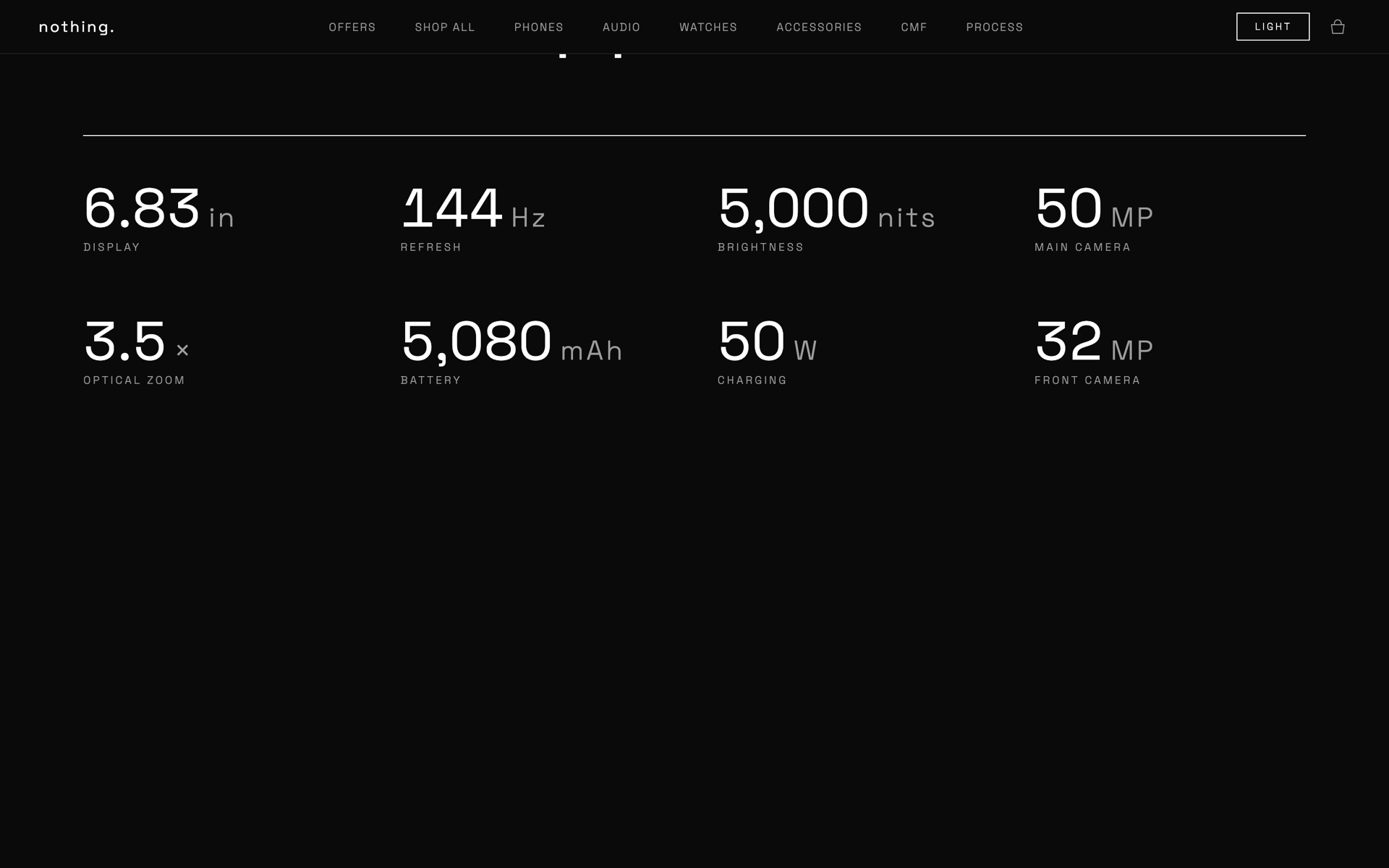
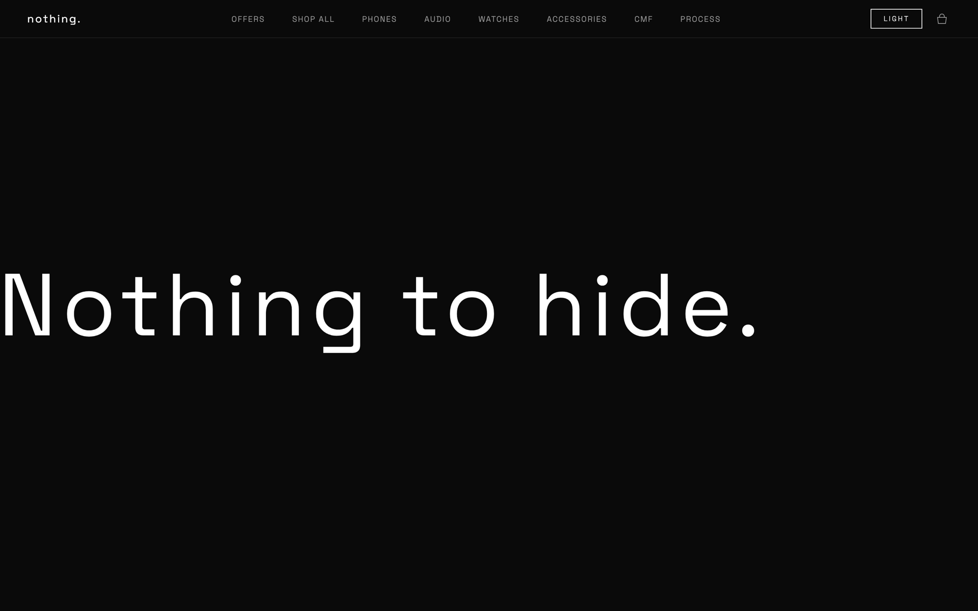
Monochromatic foundation (#0a0a0a / #ffffff), Space Grotesk at 400/300 with minimum 0.08em tracking on headings, dot-matrix and glyph patterns as structural elements rather than ornament. Motion tokens favor elastic and back easings to encode weight; no gradients, no glassmorphism, no skeuomorphism.
What changed
Results
Shipped as a public, live concept site. Demonstrates that a brand site can be a continuation of product design language, kinetic, considered, and material, without falling into decorative motion-for-motion's-sake. Functions as both a design exploration and a working proof-of-concept for scroll-driven 3D brand work.
Learnings
Performance discipline matters more than visual ambition in 3D web work: every geometry, light, and draw call is a real cost. Strict separation between React (layout) and Three.js (scene) made iteration faster and prevented the common trap of conflating render lifecycle with component lifecycle. Anti-design is a constraint, not a free pass; restraint takes more decisions than decoration.
Next steps
Build out product detail sections with instanced dot-grid backgrounds, add a configurator surface that responds to cursor and scroll, explore WebGPU for the heavier scenes, and tighten mobile fallbacks (currently desktop-first at 1440px). Eventually wire in a real CMS layer so the brand language can extend beyond a single hero moment.
Next project
One Clear Record, From the Surgery Board to the Pet Parent's PhoneMediClear · Veterinary Practice OS · Client Product · 2026
See all works