The Name Was Already the Argument. Nothing in the Brand Was Using It.
A full identity and website redesign for a B2B marketing agency, built on the one asset it already owned and never used: its name. Sales plus marketing, made visual as two overlapping circles resolving into an S, then carried across a palette, a homepage, and an eight-page brochure.
The Gap
Business gap
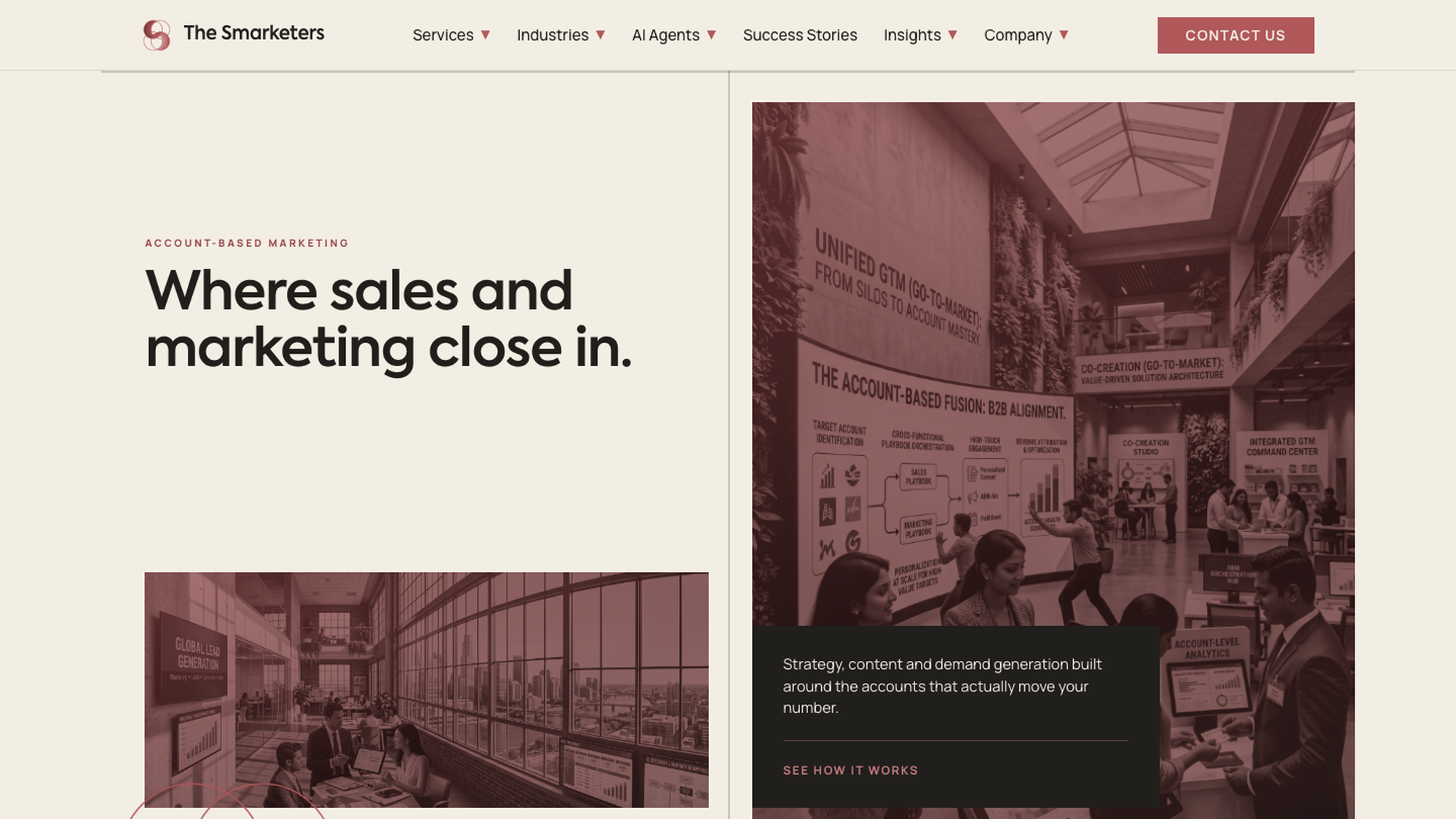
The Smarketers runs account-based marketing for technology companies, with an ITSMA award, a HubSpot Platinum partnership, and Fortune 1000 clients on the roster. The identity said none of it. The mark used several colours with no hierarchy, went busy at small sizes, and connected to nothing else on the site. Around it sat the standard agency template: a deep mega-menu, a badge wall near the top, generic service icons, AI-native language throughout. Nothing in it was wrong. It just was not theirs.
User gap
The buyer is a committee evaluating a high-value purchase over a long cycle, and unmoved by energy. Every competing agency was selling the same three claims: AI-native capability, outcomes over vanity metrics, senior operators over junior teams. With AI adoption in ABM above ninety percent, announcing it signals membership in the category rather than difference within it. The look had converged too — cold blues, badge walls before any argument, the 'not X, but Y' construction repeated to invisibility. A committee reading six of these pages cannot tell them apart.
A design assessment produced for The Smarketers' senior designer brief, not a live client engagement. Figures and the testimonial shown in the applied work are illustrative placeholders rather than verified claims about the company.
How I worked
Research
I read the agencies competing for the same accounts — Directive, RevvGrowth, TripleDart, Demandbase — alongside product companies whose restraint I wanted to borrow: Linear, HubSpot, Freshworks. Differentiation was not available in the claims, because everyone was making them. It was available in tone and craft. If every competitor looks like the software their clients buy, there is open space for a firm that looks like the senior advisor their clients hire.
Strategy
'Smarketers' is a contraction of sales and marketing. That is the entire proposition, and it was doing almost no work in the identity. A brand whose name already contains its thesis should not have to explain the thesis separately. So: make the name mean something visually, then repeat it at every scale. The register sits closer to a strategy consultancy than a martech vendor — warm neutrals rather than cold blue, one accent used sparingly, restraint as the premium signal.
Wireframes
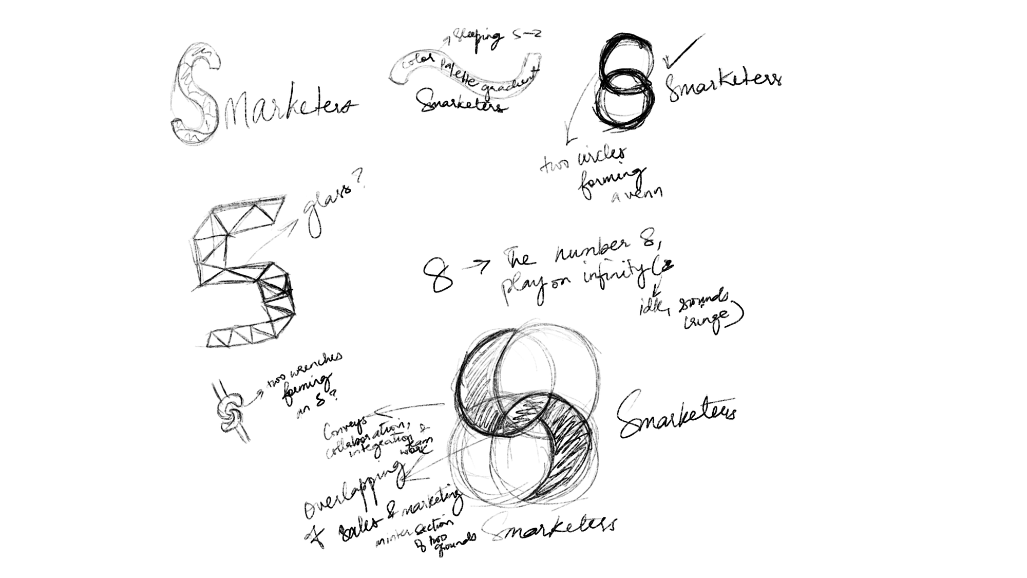
Logo exploration was hand-drawn before any tool was involved: five territories sketched in Procreate, with the reasoning left visible on the sheets. The overlapping-circle direction was developed by hand, then built in Figma. The site was sequenced before it was styled — relevance, differentiation, proof, objection handling, action — with nothing asking for commitment before it had earned it.
Iterations
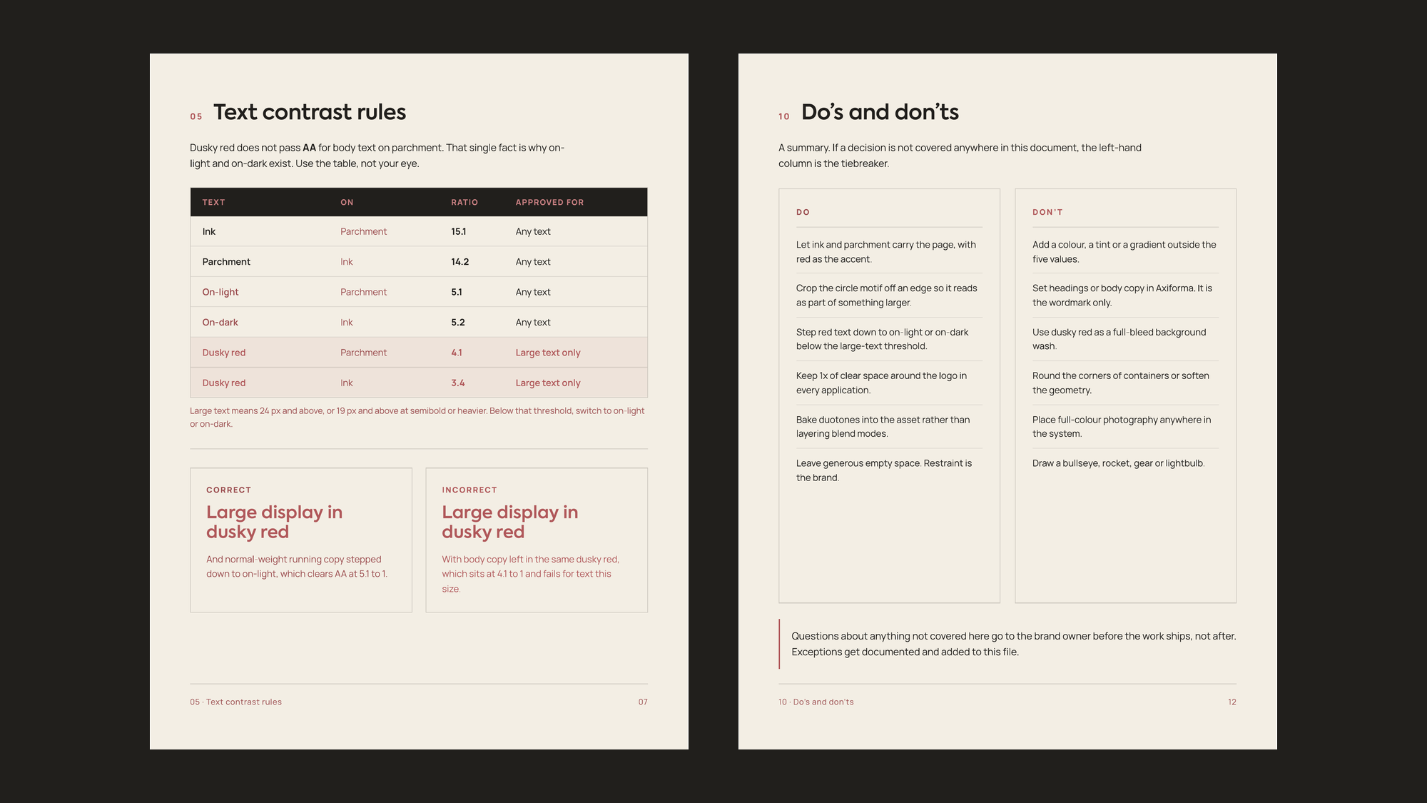
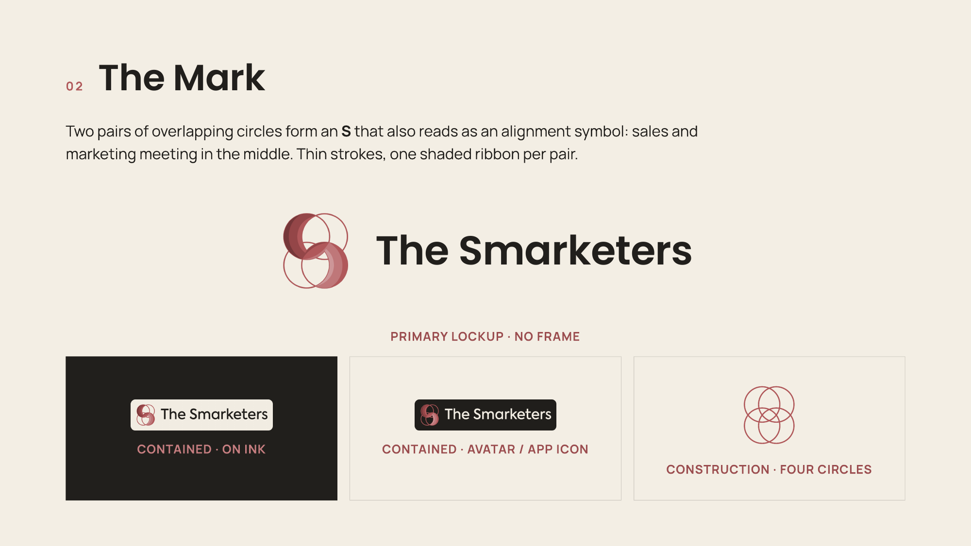
The corrections mattered more than the concepts. A four-circle cluster was cut for diluting the alignment story. A pill-container lockup was rejected because a mark that only works inside a frame is not a usable mark. The strokes came down twice — the note in the corner of the sketch sheet reads 'need to be thinner.' The most consequential change was not visual at all: a WCAG check showed the core accent failing normal-text contrast on both grounds.
What we built
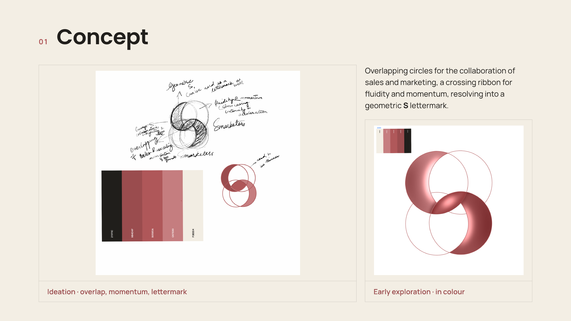
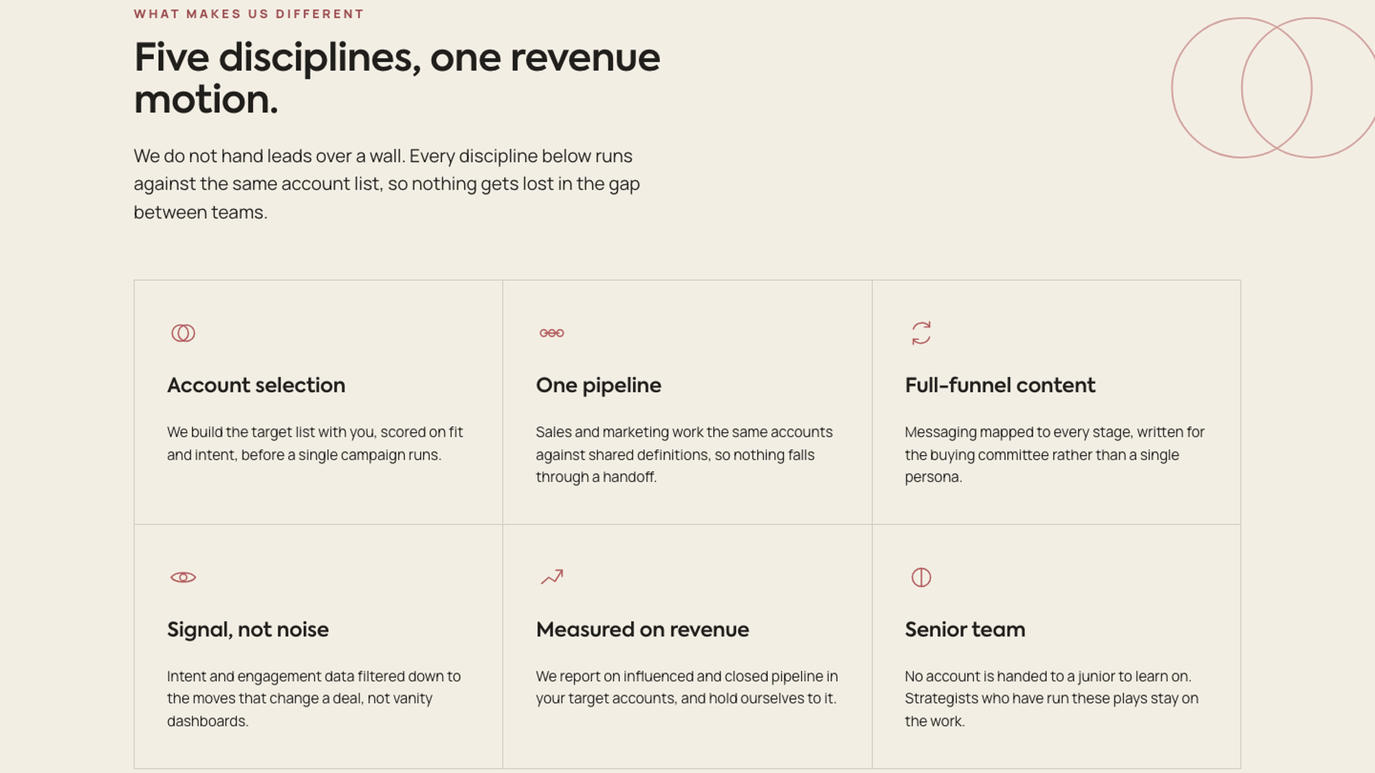
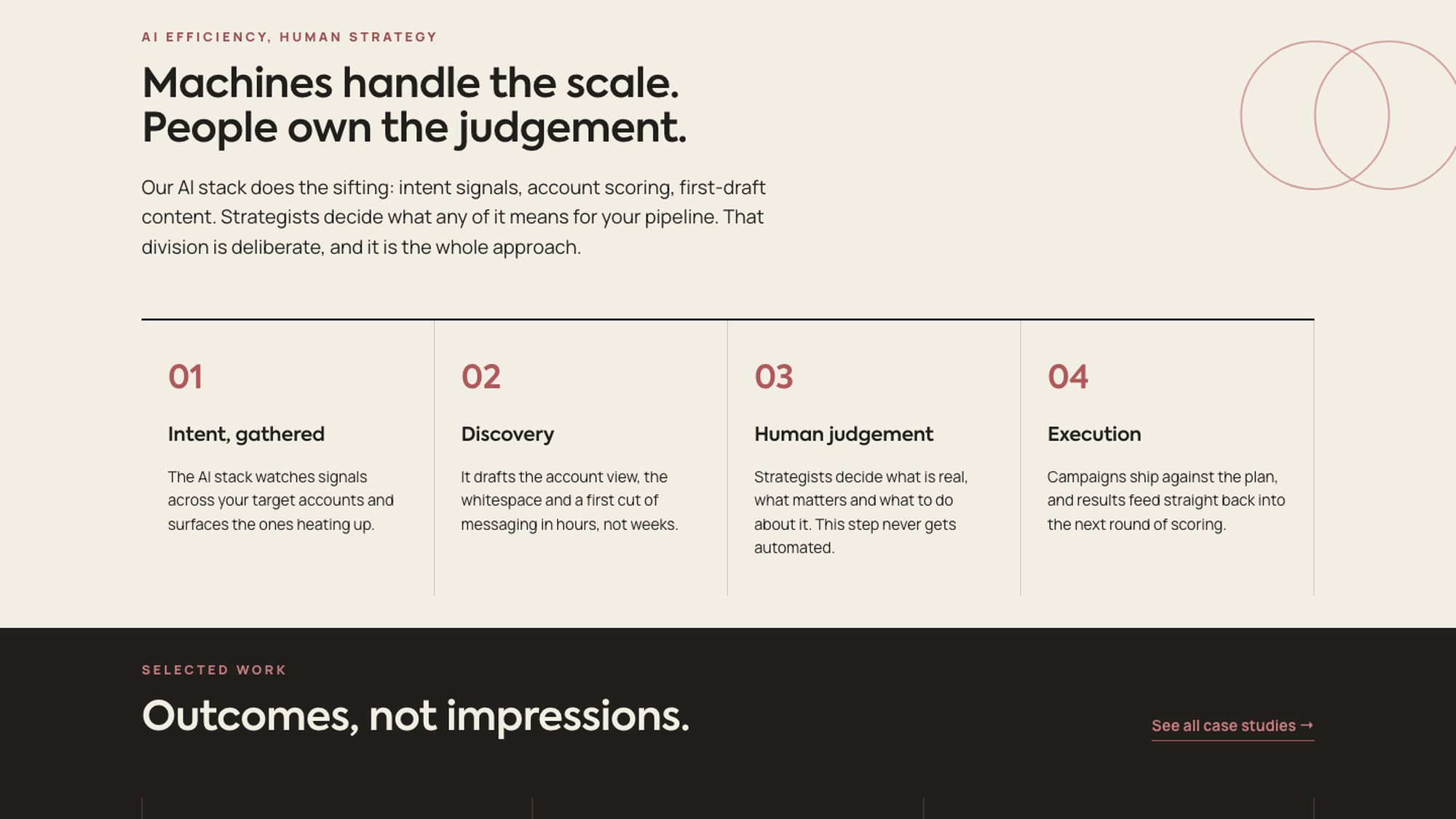
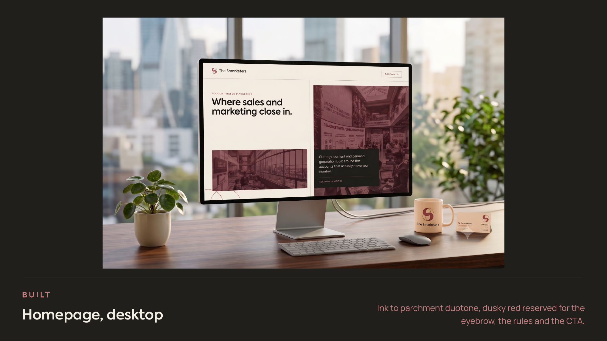
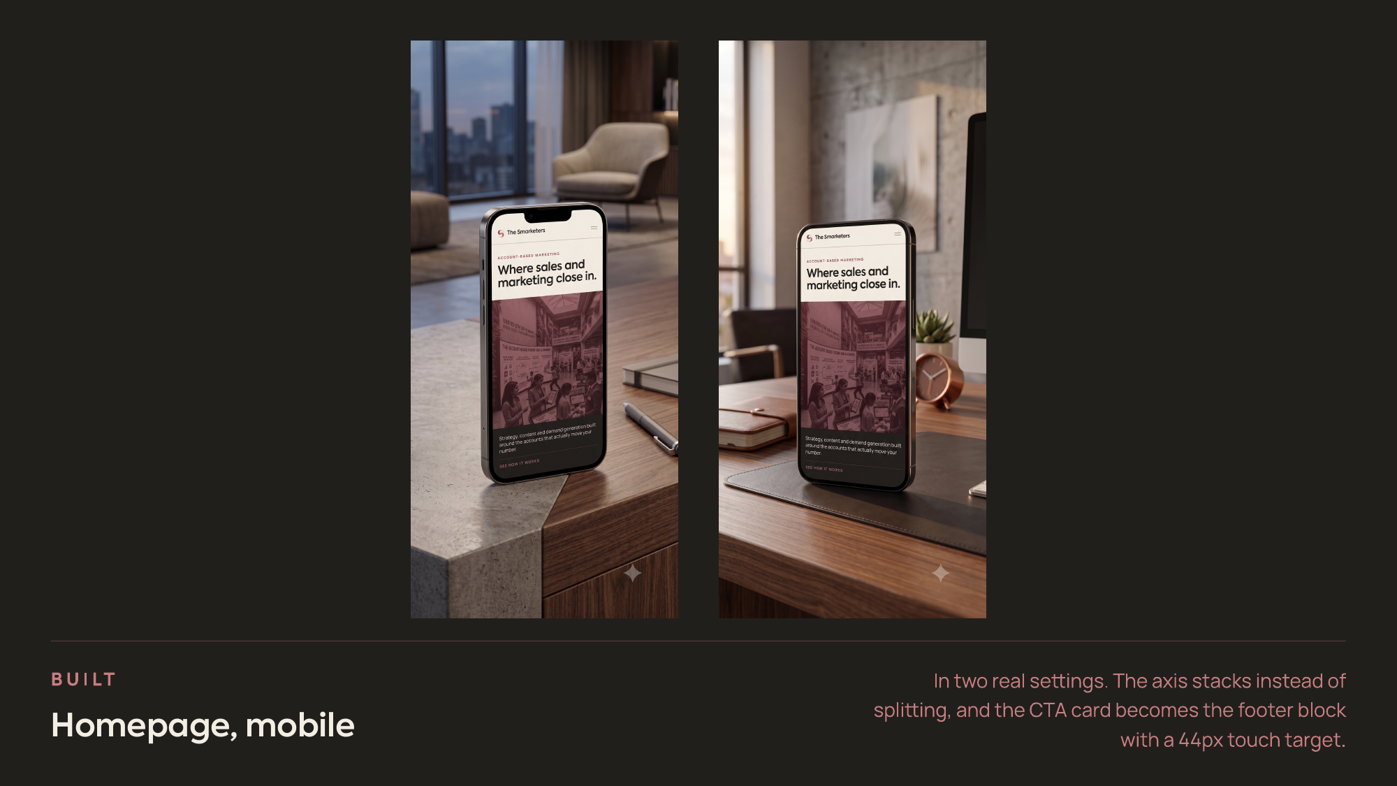
One mark, one palette, one page order, across five surfaces. The mark is four circles in two overlapping pairs resolving into a geometric S — two overlapping circles is a common collaboration device on its own, so the lettermark reading is what makes it specific to this company. That geometry recurs as dividers, backgrounds and covers under one rule: the circles must actually intersect, because adjacent circles read as decoration and overlapping circles read as the brand. The homepage does one thing in the hero and sections the rest by alternating ink and parchment grounds rather than borders, with the badge wall moved to after the work, where recognition confirms instead of introduces.
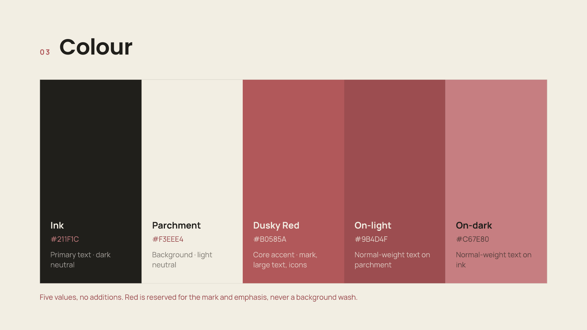
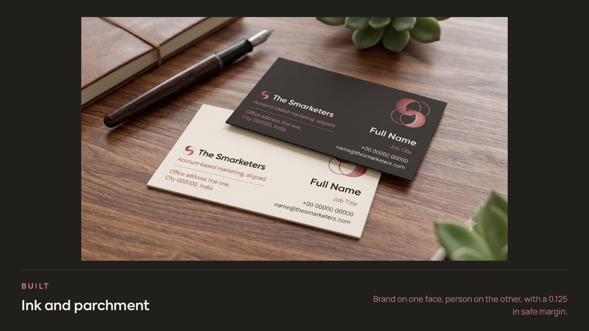
Five values, no additions: ink #211F1C and parchment #F3EEE4 as the neutrals, dusky red #B0585A as the core accent, and #9B4D4F and #C67E80 as calibrated text shades for light and dark. Each has a stated job, so the palette is a system rather than a collection. The accent carries the most weight. Every competitor runs cold blue and gradient tech aesthetics borrowed from the SaaS products their clients buy, which makes the agency look like the software instead of the advisor who picked it. Dusky red was tested against terracotta and burgundy — warmer and more alive than burgundy, more grounded and less orange than terracotta — and it takes the one position the category has left open. Axiforma carries the wordmark, Manrope the body and UI. Icons are thin-stroke, built from circles and arcs on the same logic as the mark; photography is duotone only. The guidelines are written to be checkable rather than aspirational: clear space, minimum size, misuse rules, and a contrast table with approved use per pairing.
What changed
Results
The identity makes the name mean something, restating the thesis from favicon to full-bleed cover without writing it out again, and it separates the firm from a converged category before a word is read. The accessibility work is the part I would point at first: ink on parchment measures 14.2:1, past AAA, while the core accent measured 3.4:1 on ink and 4.1:1 on parchment and failed the 4.5:1 threshold for normal text. The two added shades clear AA, and the accent is now reserved for large text, icons and graphical elements.
Learnings
Restraint is a constraint, not a shortcut. Generated layouts trended busier than the strategy allowed, every time, and reducing them to alternating grounds and one accent was continuous manual editing. The same went for copy: first drafts reached for the category's stock phrasing, and rewriting toward plain, specific claims was the actual work. The division of labour with AI stayed consistent — the thinking and the judgement were mine, AI executed what I had already worked out. The contrast failure is the clearest illustration, because manual testing caught it and the tool did not.
Next steps
The twelve-week plan I wrote alongside this names what a compressed timeline cost rather than implying it cost nothing. The work applies a consistent set of tokens and documents them, but it is not yet a formal component library with defined variants and states — the difference between a system that holds and one that drifts. The same applies to research depth: this is desk research and category analysis, enough for a defensible direction but not the same as having tested it.
Next project
Redesigning Document Processing into an AI-First Workflow SystemDocufy · AI Document Analyzer · Concept · 2025
See all works