Your Screen Is Full HD. So Why Does Everything Look Broken?
Display scaling is the most common thing nobody on your team is testing for. Here is what it is, who it affects, and what to do about it.
TL;DR
- –A Full HD screen at 150% Windows scaling gives the browser 1280px, not 1920px. Most layouts were never tested at that width.
- –A 13-inch MacBook at its default "Looks Like 1280x800" setting also delivers 1280px. Same problem, different OS.
- –Designers working at "Looks Like 1680x1050" on a MacBook Pro are designing 400px wider than most users will ever see.
- –The fix is not percentage-based CSS alone. It is fluid layout + relative units + content-driven breakpoints, tested at the widths users have.
- –This is an accessibility issue, not just a visual one. WCAG requires content to remain functional at scaled viewports.
The gap nobody is testing for
A user opens your web application on a Full HD laptop. Nothing is wrong with their hardware. And yet the sidebar overlaps the content, a table column is clipped, there’s a horizontal scrollbar where there shouldn’t be. They just know it looks broken.
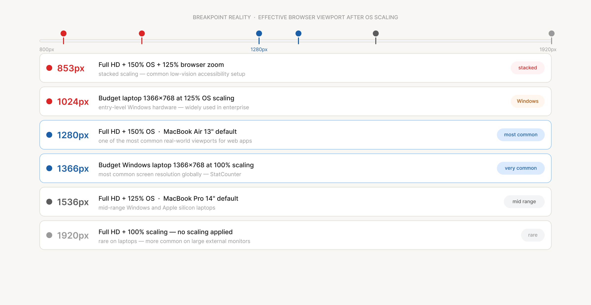
The cause, almost every time, is display scaling. And the reason it ships is almost always the same: nobody on the team tested the application at the viewport that user has. Resolution and scaling are not the same thing: a 1920×1080 screen stays 1920×1080 in hardware regardless of scaling. What scaling changes is the logical viewport the browser receives. At 150% on Windows, a Full HD screen delivers 1280px to the browser. It renders sharply thanks to pixel density, but the layout space your application gets is the same as a 720p monitor.
Windows 100%
1920px
Full viewport
Windows 125%
1536px
Common on mid-range laptops
Windows 150%
1280px
Default on most 13″ laptops
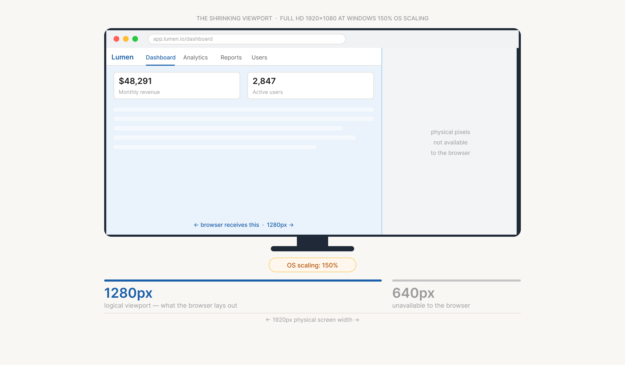
This is not an unusual configuration. It is the default. Any Windows user who hasn’t deliberately changed their display settings is almost certainly at 125% or 150%, because Windows recommends it based on screen size and pixel density.
macOS does the same thing, differently
Apple frames scaling as “Looks Like” resolutions rather than percentages, and a MacBook user sees options like “Looks Like 1280×800.” Friendlier language, identical effect on the browser.
■ Windows
- –Expressed as percentages: 100%, 125%, 150%
- –Supports non-integer values
- –Full HD at 150% → browser sees 1280px
- –devicePixelRatio of 1.5 at 150%
- –Non-integer scaling can look slightly soft
□ macOS
- –Expressed as "Looks Like" resolutions
- –Retina uses clean 2x integer scaling
- –MacBook Air 13″ default → browser sees 1280px
- –devicePixelRatio of 2 on all Retina screens
- –Sharp output because of integer scaling
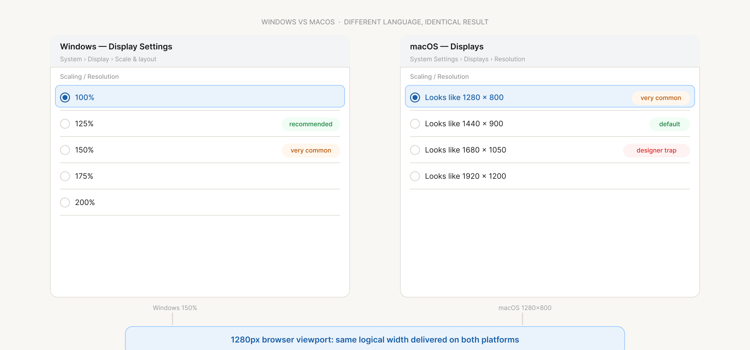
A 13-inch MacBook Air at its default setting and a Windows Full HD laptop at 150% scaling are both giving the browser 1280px. Different hardware, different operating systems, same viewport. If your application breaks at 1280px, it breaks for both. 4K monitors follow the same pattern: at 200% on Windows, or the equivalent on a 5K iMac, the browser receives 1920px regardless of physical resolution, and the layout concern mostly goes away. What remains is image quality: raster graphics blur at 2× density because the screen has more physical pixels than the asset was designed for. SVG solves this entirely.
The thing most design teams do not realise
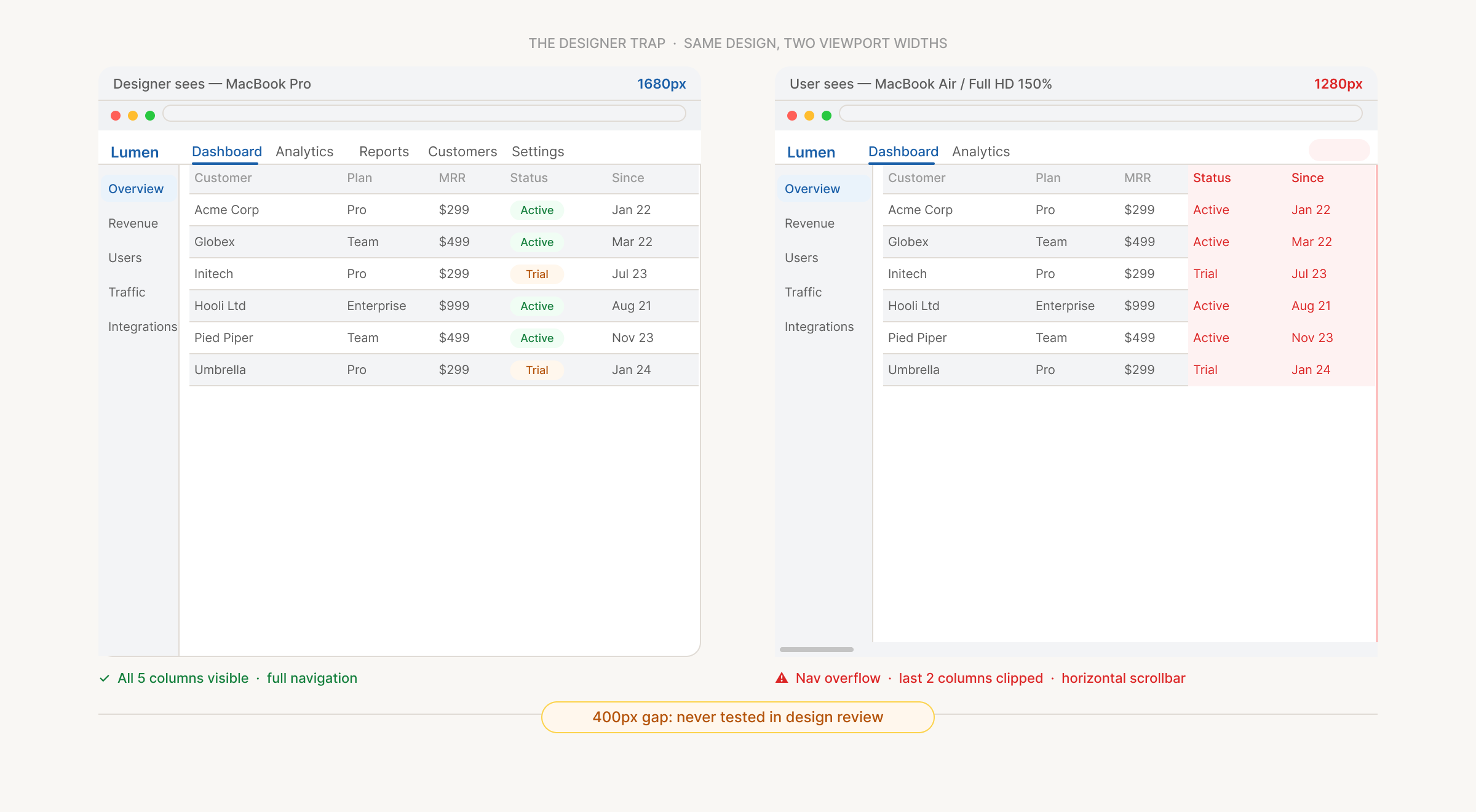
If you are designing on a MacBook Pro set to “Looks Like 1680×1050,” you are working 400 pixels wider than most of your users will ever see.
Designers on MacBook Pros often set the display to a “More Space” option for extra real estate in Figma, commonly “Looks Like 1680×1050.” It feels reasonable, but it means every design reviewed there looks balanced at a width a 13-inch Mac user, or a Windows laptop at 150%, will never have. Layouts that look fine at 1680px can be completely broken at 1280px: sidebars overlap, navigation overflows, tables collapse. Because nobody on the team experiences the app at 1280px during review, that breakage doesn’t surface until a user finds it.
Quick check
Open Chrome DevTools, set the viewport to 1280px, and load your application. What you see is exactly what a large portion of your users see every day.
Why UX and accessibility are the same conversation here
The instinct is to call this a CSS bug. The real cause sits earlier, in the design process: mockups are drawn at 1920px, prototypes reviewed on large monitors, and scaling is nobody’s job to test because nobody framed it as a UX concern. The users affected most are not an edge case: people with low vision who rely on scaling to make interfaces readable, people with motor impairments who need larger targets, older users for whom default sizing is physically too small, and a much larger population who simply use the machine as it came out of the box.
Scaling is not a workaround. It is how a significant portion of your audience sees your product every day. When a scaled viewport breaks your layout, you haven’t just introduced a visual glitch. You’ve made the application harder to use for the people who need flexibility the most.
What the standards say
WCAG 2.1 requires text to remain functional when resized to 200% (SC 1.4.4) and content to reflow to a single column at 400% zoom without horizontal scrolling (SC 1.4.10 Reflow). With ADA Title II now requiring WCAG 2.1 AA compliance, these are legal requirements with deadlines in 2026 and 2027.
What holds up
Percentage-based widths help but are not sufficient on their own. They handle proportional containers but have no concept of minimum readable text sizes, comfortable line lengths, or when a layout should structurally change. The full solution combines a few techniques:
CSS Grid and Flexbox over fixed-width containers
A grid set to repeat(auto-fill, minmax(280px, 1fr)) adapts to whatever space is available with no media queries required. The layout responds to the actual viewport, not an assumed device width.
Relative units for font sizes and spacing
rem and em respond to the user’s browser font preferences, which means a user who has set a larger default font size gets a layout that accommodates that without breaking.
CSS clamp() for smooth, controlled scaling
font-size: clamp(16px, 1.5vw, 22px) never drops below readable and never overshoots on wide screens, without a single breakpoint or media query.
Content-driven breakpoints
Placed where the design breaks, not at assumed device widths. Test at 1280px and 1536px. Those correspond directly to Full HD screens at 150% and 125% Windows scaling, and to common MacBook defaults. If the layout holds at those widths, the majority of scaled viewports are covered.
For 4K and Retina screens
Use SVG for all icons and logos. They are resolution-independent and render perfectly at any pixel density with no extra work. For photographs, use srcset to serve a 2× version to high-DPI screens.
Quick reference
| Scenario | Browser Sees | Fix |
|---|---|---|
| Win Full HD at 150% | 1280px | Fluid grid, test at 1280px |
| Win Full HD at 125% | 1536px | Avoid fixed px widths |
| Mac MacBook Air 13″ (default) | 1280px | Same as Windows 150% |
| Mac MacBook Pro 14″ (default) | 1512px | Generally safe, watch tables |
| Win / Mac 4K at 200% | 1920px | SVG assets, 2x images |
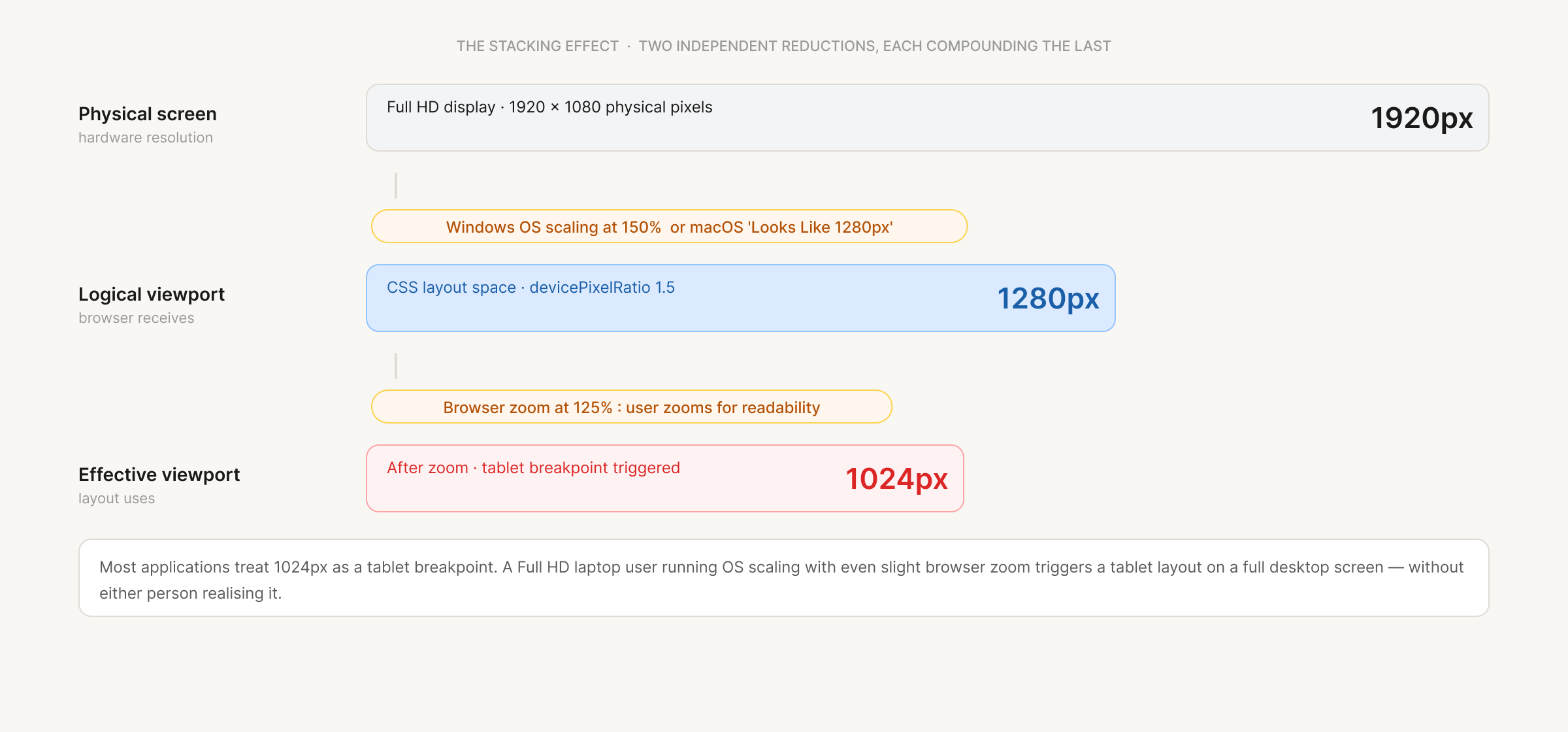
| Browser zoom 150% on top of OS scaling | ~853px | clamp(), content breakpoints, rem units |
The screen is Full HD. Retina. 4K. All of those things can still be true while the browser is working with 1280 logical pixels. Building for the physical screen is building for the wrong thing. Build for the viewport. Test at the widths your users have. The rest follows.