Every Grocery App Sells You Items. None of Them Sell You Dinner.
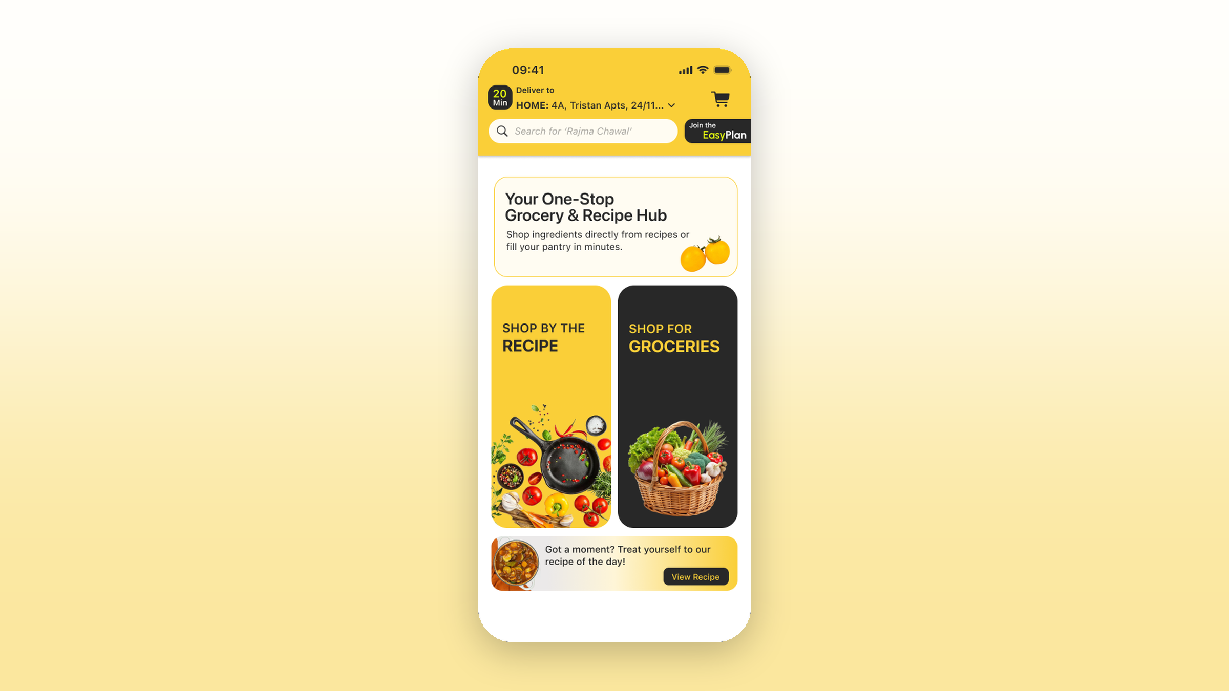
Designed an iOS grocery app with a second mode that sells the recipe instead of the basket: pick masala dosa, get all seventeen ingredients scaled to your portion count, down to the 2g of turmeric, in one cart.
The Gap
Business gap
Indian quick commerce has converged on a single axis. BigBasket, BlinkIt, Swiggy Instamart and Zepto are all competing on how fast a basket of catalogue items reaches a door, which leaves price and delivery time as the only levers, and both are expensive to hold. Gourmet Garden sits at the curated end of the same model. Meanwhile the Western meal-kit format never translated here, because it assumes a household that does not already cook from scratch every day and does not already own a full spice box. Benchmarking those five made the vacancy obvious: the recipe is where the demand actually originates, and no one owns the step between deciding what to cook and filling a cart.
User gap
The gap sits between 'I want to make masala dosa tonight' and a filled cart. If you know the recipe you have to translate it yourself into seventeen line items and guess every quantity at the shelf. If you do not, you open a recipe site in a second tab and toggle back and forth. Both paths end the same way: a 100g packet of curry leaves bought for a dish that needs 4g, softening in the fridge drawer. Portion arithmetic is the other half of it. Recipes are written for four, most weeknight cooking is for one or two, and every quantity gets halved in your head while you are standing in an aisle.
GrocEasy is a self-directed concept project. It is not affiliated with, endorsed by, or built for any of the services named in the competitive analysis.
How I worked
Research
Five competitors were pulled onto an internal analysis board and compared on where each one puts the recipe. The answer, consistently, was nowhere, or in a content blog with no route back to a cart. That framed the opportunity as a structural one rather than a catalogue one. The user side drew on how Indian home cooking actually works: the pantry staples are already owned, the spices are already in the house, and what is missing on any given evening is the specific fresh set for one dish.
Strategy
The organising decision was to keep one app with two peer modes rather than build a recipe app that hands off to a grocery app. Shop for Groceries and Shop by the Recipe sit side by side on the opener with equal weight. That choice is cheap to make on a splash screen and expensive to honour everywhere else, because the two modes hold structurally different things: a recipe is a bundle whose quantities scale with a portion count, while groceries are loose items with their own units. The design had to carry that difference all the way to checkout without asking the user to think about it.
Wireframes
Three screens carried the weight. The recipe detail page holds cook time, calories per serving, macros, allergens, what the kit includes, what you are assumed to already own, and the ingredient list with per-portion quantities in grams and millilitres, so collapse behaviour on that list was tested until the page stayed scannable without hiding the thing it exists to show. The cart was where the two-mode decision came due: merging both sides into one list would have dissolved the recipe back into loose SKUs, so it carries a Recipe Cart and Grocery Cart toggle at the top and each side keeps its own arithmetic. Discovery took its mechanic from Tinder. One dish fills the screen, photograph first, with cook time and a two-line description beneath it and dislike, info and like as the only controls. The borrowing holds because the judgment underneath is the same shape: deciding whether you want dosa tonight is fast and largely visual, and a filter-and-sort list is the wrong instrument for it. It also answers a cold-start problem onboarding cannot, since three cuisines and a dietary set are a coarse signal while every swipe is a labelled example.
Iterations
A set of open questions was left pinned to the canvas rather than quietly resolved, which is the honest state of the file. Whether the home screen deserves an AI button or whether that slot belongs to the grocery mode. Whether the cart control lives in the top bar, the nav bar, or floating above it. Whether portion size should be set once during onboarding, before browsing, instead of per recipe. The sharpest one is the ingredients dropdown: users need to unselect what they already have, because the premise collapses the moment the app makes someone buy salt.
What we built
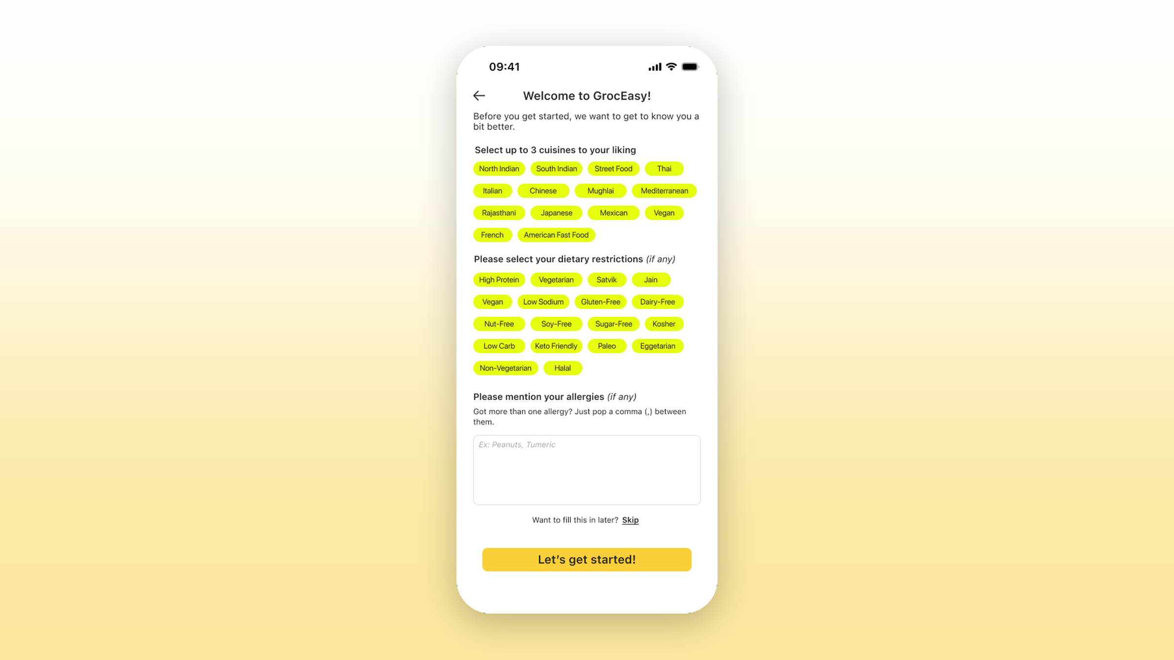
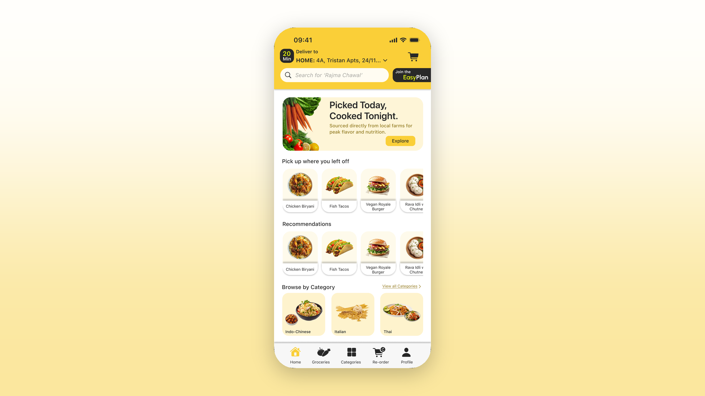
A full iOS flow from splash to live order tracking, drawn twice: once for a new user and once for a returning one. Onboarding asks for up to three cuisines out of fourteen, then dietary restrictions from an eighteen-chip set that treats Jain, Satvik, Eggetarian, Halal and Kosher as first-class rather than as footnotes to 'vegetarian', then a free-text allergy field with a worked example and a 'fill this in later' escape. From there: home with a resume carousel, category browsing, a full-bleed swipe surface for discovery, recipe detail with a portion selector, the two-mode cart with a bill breakdown and driver tip, delivery instructions as pickable chips (avoid calls, leave at the door, leave with the guard, pets at home) with a hold-to-record voice note for anything the chips miss, nine payment paths including UPI, Sodexo and cash on delivery, and a tracking screen that names the order number and what the kitchen is doing.
Primary is #FACF38 on a #FFFCF2 cream ground, with ramps from 25 to 950 across Yellow, Green, Red and Neon, plus opacity steps at 10, 20, 25, 50 and 75 percent on the primary for fills and pressed states. Urbanist carries the brand voice; SF Pro carries the system chrome, so the status bar, keyboard and nav furniture stay native rather than being redrawn slightly wrong. Buttons are a Type by Size by State matrix (rectangle, stroke and big; regular and large; resting and hover) so a variant exists for every place a button lands instead of being restyled in situ. The whole thing sits on Apple's iOS kit, including the Liquid Glass components and the light, dark and elevated system colour sets.
What changed
Results
The test for a two-mode app is whether the seam shows once the flow gets long, and here it shows in exactly one place: the cart. The toggle absorbs it. Everything downstream of that point, bill, instructions, payment, tracking, is shared, which is the result the structure was betting on. As a concept the project is unbuilt and still carries its open questions on the canvas, so what it demonstrates is the structural argument rather than a shipped outcome.
Learnings
The hard part was quantities, not screens. Committing to sell a recipe means owing the user an exact number for every line item, scaled to their portion count, in a unit they would actually measure with. Masala dosa comes to seventeen lines and the smallest is 2g of turmeric. No quick-commerce catalogue is built to sell 2g of anything, which means a portioning operation has to exist behind the app, and that is a business decision the design surfaced without being able to solve. The second lesson was about the dietary set. In this market Jain and Satvik are not edge cases, and approximating them with a vegetarian toggle is the kind of shortcut a user notices immediately and does not forgive.
Next steps
Reworking the ingredients list so users can unselect what they already own is the highest-value change, for the salt reason above. After that: a portions-first onboarding step so the portion count is known before browsing rather than set per recipe, community recipes where a user can publish their own dish publicly or keep it private, condiments as a category so premade chutneys and chutney powders have somewhere to live, a wishlist, and a decision on the AI button either way.
Next project
Transforming Developer Mode Home Pages into Productivity HubsWorkhall · Developer Mode · Web App · 2026
See all works