Cards & layout
Structural building blocks.
Content Card
A clickable card for articles or case studies, with a lift on hover.
Stat Card
A metric with label, value, delta, and an optional count-up sparkline.
Badge
A small status pill with neutral, success, and warning tones.
Pricing Card
A plan card with a count-up price, shine-swept ribbon, and feature list.
Pro
- Unlimited projects
- Real-time collaboration
- Priority support
- Custom export
Avatar
One avatar with initials fallback, status dot, and a spring-in tooltip.
Avatar Group
An overlapping avatar stack that fans out on hover with name tooltips.
Flip Card
A card that turns over on click, wide or tall, image on the front.
Click a card (or focus it and press Enter) to flip it. The front centers a circular image with a title and a muted subtitle; the back rotates to read upright. Swap the image with theimage prop or pass image={null} to drop it, and orientation switches between the wide and tall layouts. Reduced-motion visitors get an instant cut instead of the spring.
Wave Card
A teal card with an SVG turbulence filter tracing caustic light.
Real-time alerts
Get notified the moment something in your pipeline needs attention.
Glow Card
A card with a large blurred gradient blob drifting slowly behind it.
Ambient glow
A soft gradient drifts slowly behind the card, independent of the cursor.
Gradient Canvas
An editable gradient surface with drifting blobs and a live contrast readout.
Drag a handle to move that colour along the band. Arrow keys nudge, Shift for larger steps.
Misted Sky
Sky Haze
River Indigo
Ink Sky
A soft gradient built from colour stops. Below it, each stop is a card you click to open the picker: choose any colour and the card renames itself from the hex, its own label flipping black or white to stay legible on the new swatch. The band moves a colour along the gradient, Add colour blends a stop into the widest gap, and every change reprints the pills, the cards, and the WCAG ratings. Pick From scratch (the spectrum swatch) to start from two neutral stops and build a gradient up from nothing.
Postage Stamp
A die-cut stamp frame with real perforations and a duotone artwork window.
Perf 11¼ · comb · wmk absent
A die-cut postage frame built from four intersecting radial-gradient masks, so the perforations are real cutouts and the drop shadow follows their scalloped edge rather than a rectangle. Upload a photo and it prints into the window as a two-tone image; pick an ink and that duotone, the inner rule, and the denomination all reprint together. Cancel it and the postmark lands with a spring, its ink set to multiply so it darkens the paper underneath.
Collection Wallet
A sleeve holding a fanned card stack you drag out one at a time.
- SHRUSHANK UIQUIET HOURS¥63
- SHRUSHANK UIFREE BIRD¥84
- SHRUSHANK UILONG COAST¥120
COLLECTED WORKS
Silent Archive
A sleeve that keeps a fanned stack tucked behind its front panel, tops peeking over the lip. Drag a card up past the threshold (or click it, or press Enter) and it springs clear of the sleeve; only one draws at a time, and the label swaps to name it while the count tracks what is in versus out. Drag it back down to file it again. Upload a photo per stamp and each prints into its own frame as a two-tone image.
Hover Reveal Card
A text-first carousel row that reveals its photo in three beats.
The card is only as wide as its headline at rest, hover or tab to it and it genuinely grows, its photo slides in flush against the edge with no padding or rounding of its own, and a call-to-action arrives last.
Photos via Unsplash: Galymzhan Abdugalimov, Vadim Sherbakov, Mia Domenico
Accordion
An expandable panel with animated height and real ARIA semantics.
Yes. Every component here is free to copy, modify, and ship, with no attribution required.
Testimonial Card
A quote card whose quotation-mark watermark drifts with the cursor.
“We swapped our design system for these components in an afternoon. The motion is the kind of detail that gets pointed out in user interviews.”
Amara Nwosu
Design Lead, Fieldnote
Pull Quote
A card-less editorial quote spotlight in large centered type.
We replaced four spreadsheets and a weekly status meeting with one shared board.
Swipe Cards
A Tinder-style stack: drag or arrow-key to skip and save.
Drag a card, or focus it and use ← → keys.
Kyoto: Japan
Temples wrapped in autumn light and quiet canals.
Testimonial Carousel
A single-card quote carousel with drag, arrows, and dot pagination.
We replaced four spreadsheets and a weekly status meeting with one shared board.
Elena Cho
VP Engineering
Data Table
A grid-based table with sorting, FLIP row reorder, and in-cell bars.
Click a column to cycle sort ascending, descending, off; the rows slide to their new order instead of snapping. Drag the divider on a header edge to resize, with a live guide line. The Requests and Cost columns carry a proportional bar behind the value, so the table doubles as a chart. Select rows for the floating action bar, switch density, or hit Reload to see the skeleton state.
Table Toolbar
The strip above a table: search, faceted filters, column visibility.
| Company | Stage | Owner | Value |
|---|---|---|---|
| Northwind | Demo | Ravi | $24,000 |
| Umbrella Co | Lead | Jules | $8,200 |
| Hooli | Won | Mei | $61,000 |
| Initech | Lost | Ravi | $15,500 |
| Soylent | Demo | Mei | $33,000 |
| Massive Dynamic | Lead | Jules | $47,000 |
| Wonka Industries | Won | Ravi | $12,800 |
| Stark Industries | Demo | Jules | $90,000 |
The toolbar owns nothing but state you pass in: a debounce-ready search value, a selected-values map per faceted filter, and a hidden-columns list. Faceted filters open a multi-select popover with per-option counts, every active choice drops into a removable pill below, and Reset clears search and facets in one call. The View menu toggles column visibility. Pair it above Data Table or any list.
Table Pagination
A table footer with a live range label and rows-per-page select.
- INV-0001$137
- INV-0002$174
- INV-0003$211
- INV-0004$248
- INV-0005$285
- INV-0006$322
- INV-0007$359
- INV-0008$396
- INV-0009$433
- INV-0010$470
Just the footer parts: a live range label that swaps to a selection count when rows are checked, and an optional rows-per-page select that resets to page one. The page-number nav itself is the library Pagination component, installed as a dependency, so the ellipsis logic and the sliding highlight are not reimplemented here.
Expandable Rows Table
Rows with a caret that opens a full-width detail panel.
| Order | Customer | Placed | Status | Total | |
|---|---|---|---|---|---|
| #3901 | Wen Li | Aug 24 | Shipped | $148.00 | |
| #3902 | Aisha Bello | Aug 25 | Packing | $42.00 | |
| #3903 | Tomas Vega | Aug 25 | Delivered | $320.00 |
A plain semantic table, one caret per row. Expansion is a set of ids, so more than one row can be open at once (pass singleOpen to change that); the detail row spans every column and grows by height with a reduced-motion path that skips straight to open. The panel content is a render prop, here a two-up of line items and shipping address, but it takes any node including a nested table.
Tree Table
A treegrid with expandable branches and parent rows that roll up totals.
| Name | Type | Size |
|---|---|---|
| src | 20.1 KB | |
| components | 14.4 KB | |
| Button.tsx | tsx | 3.1 KB |
| Modal.tsx | tsx | 6.8 KB |
| table | 4.5 KB | |
| utils.ts | ts | 1.2 KB |
| app.tsx | tsx | 4.5 KB |
| public | 128.8 KB |
A treegrid, not a plain table: the nested tree is flattened to visible rows on every render, indentation plus a guide line shows depth, and each folder row rolls up the summed size of everything beneath it so a collapsed folder still reports its weight. Focus a row and use the arrow keys, right opens or steps in, left closes or steps out to the parent, up and down move between rows.
Pinned Column Table
A wide table with a frozen column, frozen header, and edge shadows.
| Rep | Region | Q1 | Q2 | Q3 | Q4 | Quota | Attainment | |
|---|---|---|---|---|---|---|---|---|
| Dana Whitfield | EMEA | $82k | $91k | $77k | $103k | $90k | 98% | |
| Marcus Lindqvist | APAC | $61k | $58k | $72k | $66k | $70k | 92% | |
| Priya Anand | AMER | $118k | $122k | $109k | $140k | $110k | 111% | |
| Yuki Tanaka | APAC | $44k | $51k | $63k | $59k | $60k | 90% | |
| Sofia Romano | EMEA | $95k | $88k | $101k | $97k | $85k | 112% | |
| Tomas Alvarez | AMER | $71k | $80k | $68k | $90k | $78k | 99% | |
| Ingrid Berg | EMEA | $104k | $99k | $112k | $121k | $100k | 109% | |
| Kenji Watanabe | APAC | $58k | $64k | $55k | $71k | $65k | 95% | |
| Amara Okafor | EMEA | $132k | $128k | $141k | $150k | $120k | 115% | |
| Lucas Meyer | AMER | $66k | $59k | $74k | $62k | $70k | 93% | |
| Sofia Costa | EMEA | $88k | $94k | $83k | $100k | $85k | 107% | |
| Raj Patel | APAC | $77k | $72k | $81k | $79k | $75k | 103% |
With maxHeight set this becomes a frozen-pane grid: the Rep column, the View column, and the header row all stay put, so a trackpad diagonal swipe moves through the quarters and down the rows at once. Each of the four edges carries a shadow that only shows while there is actually content scrolled behind it, measured from the scroll position. Leave maxHeight off and it goes back to horizontal-only, growing to fit its rows.
Editable Table
Click a cell to edit in place, staged per row with validation.
| Name | Role | Team | Rate/hr | Edit |
|---|---|---|---|---|
Click any cell to edit it inline. Enter commits and drops to the cell below, Tab commits and moves right, Escape throws the edit away. Changes stage on the row rather than writing through, so a touched row turns amber and shows Save and Revert; the Rate column runs a range check that blocks Save and shows the reason under the cell until you fix it.
Comparison Table
A pricing feature matrix with a pinned column and a recommended tier.
| Plans | Solo$01 seat | RecommendedTeam$12/moper seat | ScaleCustom |
|---|---|---|---|
| Core | |||
| Projects | 3 | Unlimited | Unlimited |
| Version historyHow far back you can roll | 7 days | 90 days | Forever |
| Guest access | Not included | Included | Included |
| Security | |||
| 2FA | Included | Included | Included |
| SSO / SAML | Not included | Partial | Included |
| Audit log | Not included | Not included | Included |
| Data residency | Not included | Not included | Included |
| Support | |||
| Response time | Community | 1 business day | 1 hour |
| Onboarding call | Not included | Partial | Included |
A feature matrix that stays readable while it scrolls: the feature column is pinned left, the recommended plan keeps its tint and badge down the whole table, and rows sit under sticky section headers. Cells take a boolean, a partial-support marker, or free text, and every state is drawn as an icon plus a label so it never leans on color alone. Header row sticks to the top; the whole thing scrolls sideways on a phone rather than squashing.
Metrics Table
A leaderboard on Data Table with in-cell bars, deltas, and sparklines.
This is the library Data Table with five columns wired up, not a new table. The Views column uses the bar accessor for the fill behind the number, sorting and the row reorder come from Data Table, and only the sparkline and the arrow-plus-percent trend cell are new. The rank column is fixed to each row standing by views, so sorting by trend keeps the ranks readable.
Link Preview Card
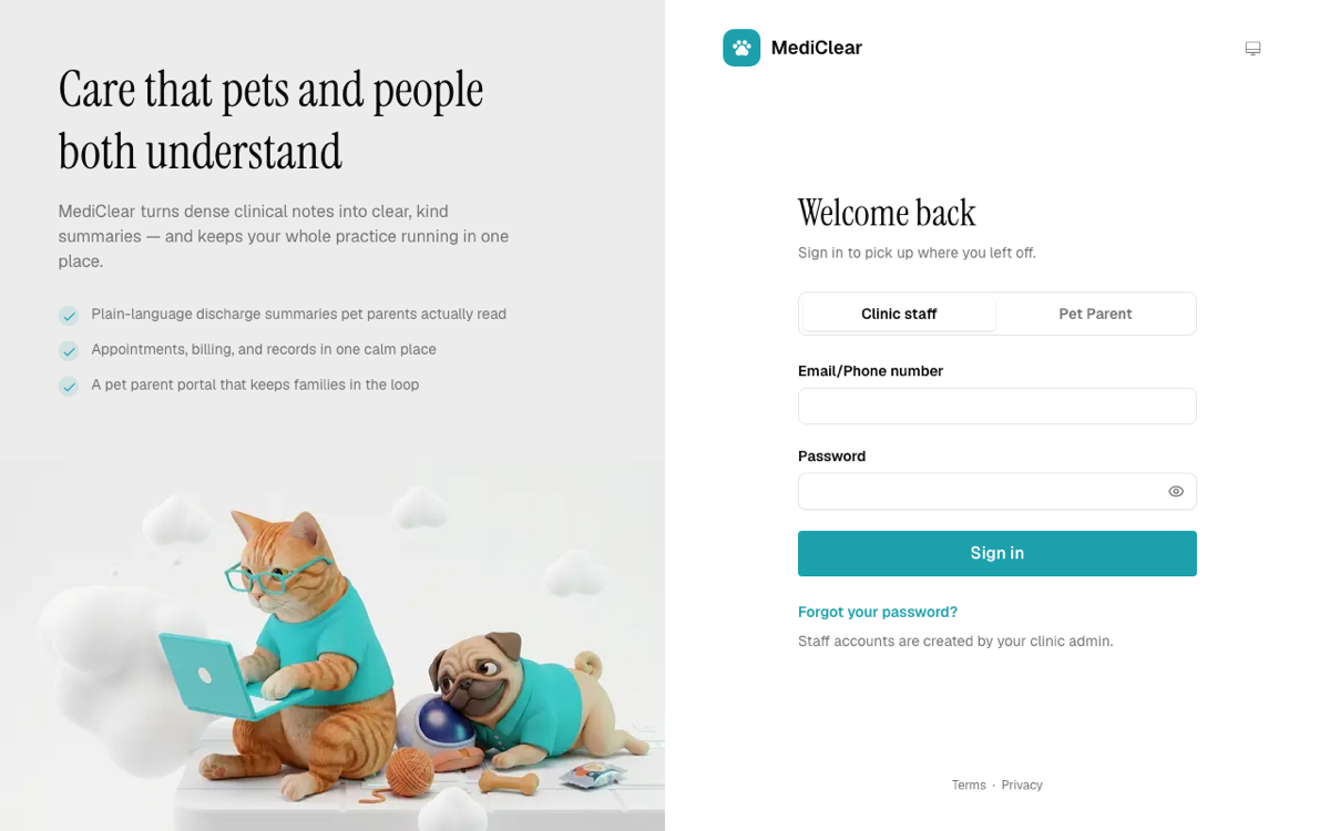
A rich unfurl card with a mocked, real, or genuinely live thumbnail.

Intelligent Empty State
A blank workspace that adapts across visits from your real click history.
Your workspace
Real visit and click counts, kept in this browser. The state genuinely changes shape as they accumulate, it is not a scripted slideshow.
Booking Calendar
Month grid, open slots, and an .ics handoff, resolved in the viewer zone.
Priya Raman
Product designer
Design review
Bring a flow that is not landing. We go through it screen by screen and leave with the next three changes written down.
- Duration
- 45 min
- Price
- 4,000
- Location
- Google Meet
Times are shown in your own timezone. Switch the zone beside the globe to see the same slots move with you.